Color Psychology in your Wardrobe
June 16, 2023 • Leave a Comment
Color Psychology in your Wardrobe

Did you know it’s been scientifically proven that colors have an influential psychological effect on how people perceive us, as well as impacting our moods? There’s a reason graphic designers, marketing teams, and brand designers are particular about what colors they select for their work – they want to instill certain emotions and reactions in their consumers.
Green and blue hues (cool colors) can help to achieve a sense of calm. Reds, oranges, and yellows (warm colors) can boost your mood. Each of these colors takes on a different meaning when separated into different shades. Light pastels are more calm and tranquil than bold energetic colors, and deep jewel tones lean towards regal and mature. You can use this when thinking about your personal and professional brand and what your headshot says about you.
Blues are a big trend in headshot photography right now because they project a very trustworthy aura. With the few seconds you have online these days to make a good impression, most people want that impression to be friendly, easy to work with and most of all trustworthy. Plus… blues go really well with skin tones.
You can use this color psychology and intentionally apply it to your wardrobe the next time you update your headshot, engage in public speaking, go to an interview, or if you just want to evaluate your closet.
“Incorporating color into your wardrobe can be a powerful tool in creating the right mood and mindset for your day.”
– Ashlee Jaine (clothing company)
Here’s a quick cheat sheet to help you get started:
- RED is passionate and powerful
- PINK is kind and feminine
- ORANGE is optimistic and sociable
- YELLOW is energetic and youthful
- GREEN is reassuring and lucky
- BLUE is calm and trustworthy
- PURPLE is creative and spiritual
- WHITE is pure and clean
- GRAY is cool and unemotional
- BLACK is powerful and elegant
- BROWN is down-to-earth and secure
When thinking about the messaging you want to convey in your professional headshot, choose colors that compliment your messaging through color psychology. I use my keyword tools to help assist my clients when choosing the right wardrobe options for them. While eyes and skin tone play a part in what you photograph best in, your personal branding words also weigh in heavily for the colors we choose to photograph you in. When working with my headshot clients, we discuss the impressions we get from the wardrobe options they bring into the studio, and we’ll do a series in the outfits they bring in to evaluate which headshot works best for the messaging they want to portray. I find this very fascinating and I love helping my clients through this experience!
The energetic waves of various colors make an impact on you and those around you. Now with the psychology of color in mind, you can design your outfits to influence personal and professional success!
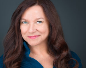
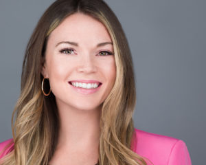
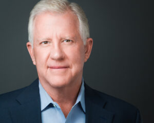
Castle Rock headshot photographer in the Denver metro area serving companies and individuals, creating modern headshots for todays business professionals.
If you’d like to dive a little deeper into understanding your target market and attracting them through your branding and professional headshot, check out my post on Understanding your Audience and Attracting your Target Market.
To learn more about headshot pricing and scheduling a session, check out this page.


[…] expression coaching is key to getting that client attracting headshot. You can also work in some color psychology into your wardrobe when choosing what to bring to your […]
[…] are and how you dress on a daily basis and bring that into your headshots. You can also work some color psychology into your wardrobe selection which gives your headshot that extra touch when viewed by potential […]
[…] Colors have an influential psychological effect on how people perceive us, as well as impacting our moods. Green and blue hues (cool colors) can help to achieve a sense of calm. Reds, oranges, and yellows (warm colors) can boost your mood. Each of these colors takes on a different meaning when separated into different shades. Light pastels are more calm and tranquil than bold energetic colors, and deep jewel tones lean towards regal and mature. You can use this when thinking about your personal and professional brand and what your headshot says about you. If you would like to look more into the psychology behind color and a full list of color descriptions, check out my post on Color Psychology in your Wardrobe. […]
write my essay canada
Color Psychology in your Wardrobe – Castle Rock Headshots